CityMetrics Dashboard
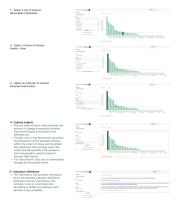
This dashboard, developed by World Resources Institute in partnership with UrbanShift and Cities4Forests, provides data on indicators across seven themes related to climate change and the urban environment including air quality, extreme heat, biodiversity, and flooding. Access the dashboard, explore case studies, and find step-by-step instructions to conduct analysis here.
Data is essential for cities to understand the impacts of climate change on their residents and their infrastructure, and how nature in the urban environment can help build resilience to future impacts. World Resources Institute, in partnership with UrbanShift and the Cities4Forests initiative, has developed dashboard of geospatial indicators to help cities visualize the local connections between climate change and the urban environment.
Access the dashboard here
This tool, available for over 60 cities, including all 23 in the UrbanShift network, provides data on indicators across seven key themes relevant to sustainability, such as air quality, flooding, and greenhouse gas emissions. For each theme, the dashboard provides multiple indicators that describe current baselines, recent trends, or projected changes related to environmental assets or climate risks and their impacts at the citywide and neighborhood scales. This information can better help these cities understand the factors influencing their assets and risk levels, prioritize and prepare for hazards, set goals, or implement targeted strategies to enhance assets or mitigate impacts. For in-depth information on the methodology underpinning the indicators, please see the peer-reviewed WRI technical note. Read more about CityMetrics here.
Scroll down to see some example insights derived from the dashboard, and to access step-by-step instructions for making the most out of the data available.
Data in Action
Extreme Heat
Extreme heat is already a challenge in cities: an average of 489,000 people around the world die from extreme heat every year, making it the single deadliest climate-change related event in most years. As climate change intensifies hazards, cities will be especially vulnerable due to the urban heat island effect, which exposes residents to even more dangerous temperatures.
For cities, the dashboard can help illustrate where heat-related risks pose the greatest threats to residents. Under the Heat theme, neighborhood-level data for land surface temperature, surface reflectivity, and built land without tree cover is available, along with city-level data forecasting extreme heat hazards in the future. Mapping these indicators by neighborhood enables a city to see where the greatest risks are currently, and where mitigating interventions could be most effectively applied.

For example, in Barranquilla, Colombia, which is forecasted to have the greatest overall increase in extreme heat hazard over the next 30 years, mapping the land surface temperature indicator clearly shows which neighborhoods are already facing the highest temperatures. The dashboard also show that these same neighborhoods have the lowest surface reflectivity and tree cover, indicating potential data-informed solutions for the city to consider. Similar analysis can be performed for the cities available to help prioritize known and effective solutions like increasing urban tree cover and improving surface reflectivity.
Flooding
As climate change disrupts typical rainfall patterns in many places in the world, it’s essential for cities to understand how their vulnerability to flooding may increase. Of the 35 cities analyzed in this dashboard, Surat, India faces the highest expected change (8.5%) in maximum daily precipitation over the next 30 years.
Cities like Surat can analyze a number of indicators to better understand and prepare for present and future flood risks. For example, impervious surface areas--which in urban areas are typically buildings, roads and other pavement types—can prevent water from soaking into the ground and contribute to the prevalence of localized flooding. While most of the area surrounding Surat has relatively low levels of impermeability, the impermeable surfaces compose 41.6% of the city itself. Incorporating more natural cover or using building materials that allow rainfall to flow into the ground could increase the city’s resilience to flooding.

Additionally, topography is a critical factor for cities to understand when assessing flood risks. During periods of intense rain, steep slopes are vulnerable to mudslides, especially if they are not covered with vegetation. To enable cities to understand which areas are most vulnerable, the dashboard displays the percentage of steep hillside slopes without vegetation cover—which in some areas surrounding Surat, is as high as 85%. To increase resilience in the face of potential flood risks, cities can use this data to target mitigation efforts, like increasing vegetation cover and shoring up hillside developments to prevent landslides.
How to Use The Dashboard

Learn More
If you’d like to learn more or request a demonstration, please reach out to shiftcities@urbanshift.org.

